Creating beautiful objects as a designer: what's the plan?
Mistake n°1: assuming beauty will just “happen.” But it doesn’t, it has to be planned. Here are 3 things I always check to know if I’m really on track.
What makes Bouroullec Brothers, Konstantin Grcic, and Philippe Starck design legends?
Their multifunctional chair? The new ergonomic pasta colander? The flat-pack living room screen?
No. It’s the beauty of their products.
Beauty is the perfect combination of many things, but there are three I usually check to be sure I’m going in the right direction. The final result is always a matter of “touch,” but here are a few steps that can be crucial.
1. Be sure there’s a story
People’s stories are what make them great. The fascination with a person isn’t about their looks or their money, it’s about what’s behind them.
If you see a 147 cm old man walking on a street in London, you just don’t care.
But if that man is Danny DeVito, you freeze, thinking about Batman Returns, Twins, or The War of the Roses.
So your story defines you. Same for objects.
When you are truly inspired, not just doing it for marketing, but to create something with value, you have a strong starting point.
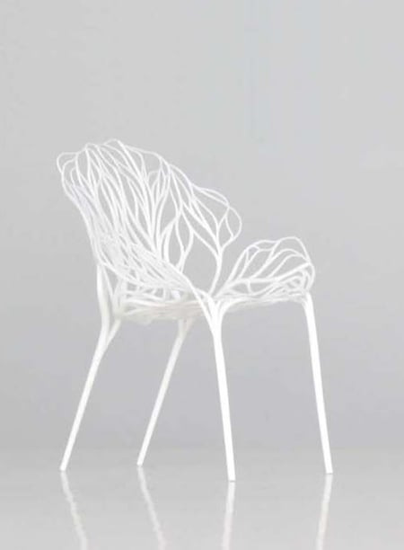
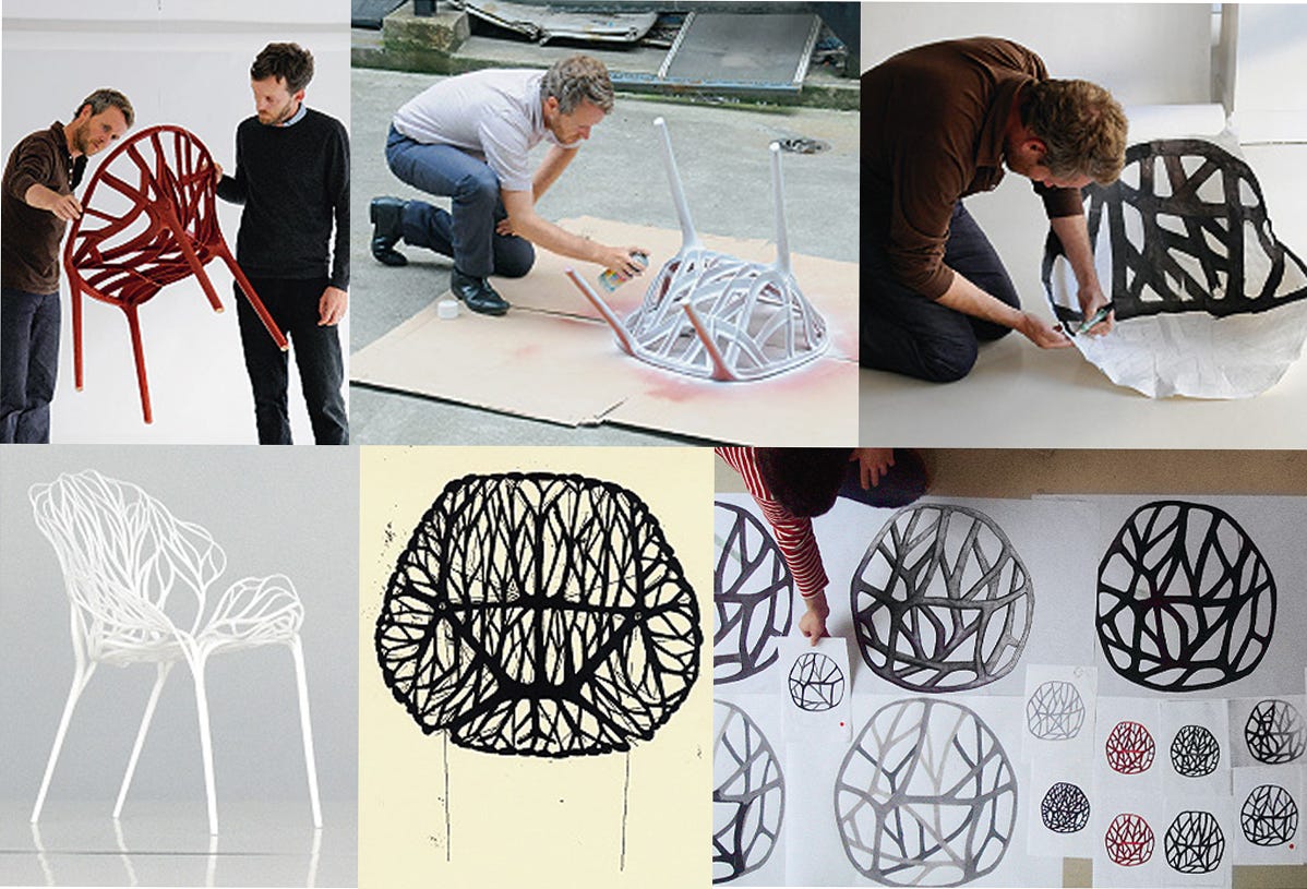
One great example is the Vegetal Chair by Bouroullec Bros for Vitra.
I always use this example in my Design Method course at Sichuan Normal University.
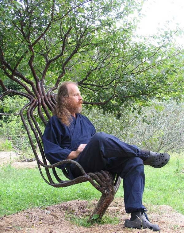
The chair was inspired by the plant structures used in the 20th century to grow shaped garden furniture.
They tried to translate that idea into a mass-produced object, but it wasn’t smooth.
At first, they designed a thin, natural form that was impossible to manufacture.
But they didn’t surrender.
They adapted the design until it worked technically and retained the inspiration.
The final result? Iconic.
And don’t forget, this was 2009. No one had done anything like it. It was heavily copied afterwards.
A good story gives meaning to a chair inspired by vegetation.
2. Function first? It’s not a race
There are a million ways to approach design. Every category is different, and I won’t generalize.
But in furniture and lighting, designers sometimes invent functions just to justify a new shape.
Take the ceiling lamp that gives a perfect cone of light on your porridge.
It sounds useful, but is it solving a real problem, or just adding noise?
Function can be a great source of inspiration, but only when it’s in harmony with form.
Especially for objects that live in a room and affect the atmosphere.
A designer who gets this balance right is Stefan Diez.
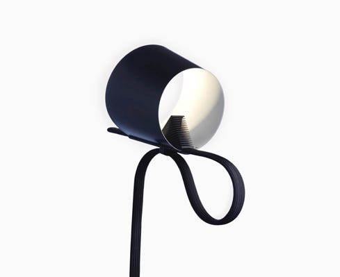
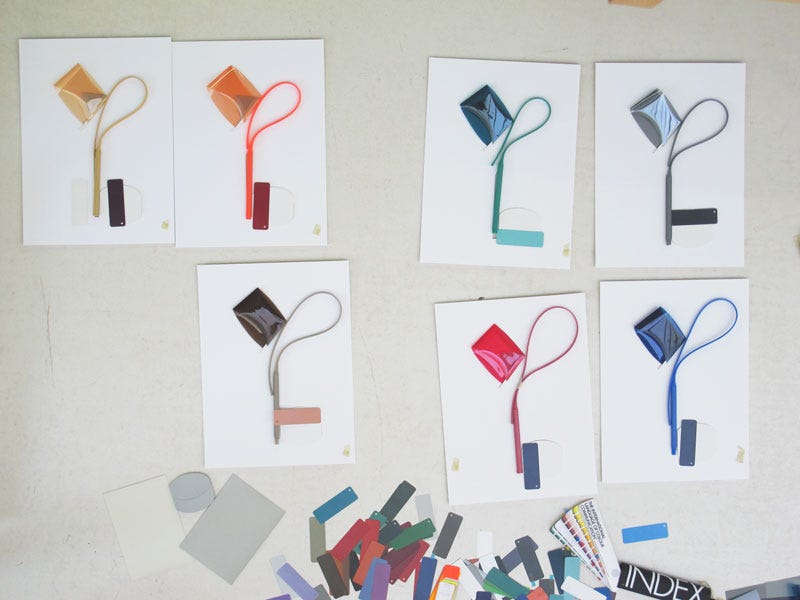
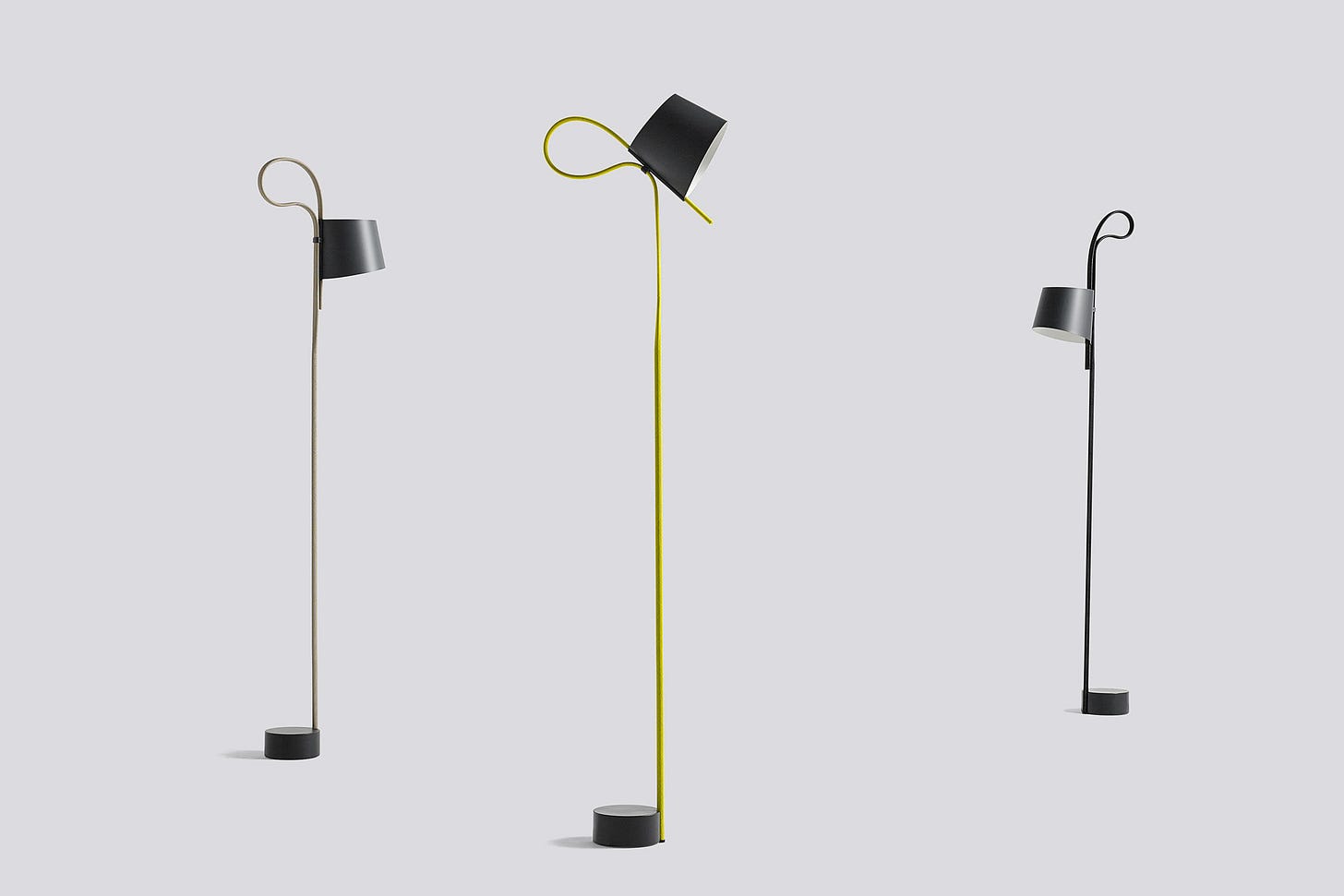
Look at the Rope Trick lamp for Hay.
It uses a unique mechanism to adjust the lamp’s height, and that function is beautifully integrated into the overall design.
The interaction, movement, and proportions are all influenced by technology—but the result doesn’t look like an engineer built it.
It looks crafted. Every part has a role. Nothing feels added after.
I don’t know how successful it was commercially, but it’s an extremely well-executed project.
3. Test proportions
There’s no magic rule for proportions.
Anyone who tells you the Golden Ratio solves everything is lying.
There may be cases where it works, but even the “G” in the Google logo isn’t a perfect circle.
And that’s for a reason.
If you’re designing an object with no decoration, your proportions become everything.
Otherwise, it won’t look essential, it’ll just look basic.
Proportions are subtle. They take testing.
And sometimes the only way to figure it out is to try it in real space.
(Decoration is another topic - maybe for a future post.)
And you? What’s your plan to create beauty? Let me know in the comments or via DM - method comparisons are one of the best ways we grow as designers.
Tap ❤︎ - it helps me know what’s working and gives me fuel to keep going.
And if you share it with a friend, I’ll toast to you with my next beer.
Studio life
Yes, I was in China again. Guangzhou, Zhongshan, Shenzhen, Foshan… all in 5 days, flights included.
I’m honestly running low on energy, but I’ll hold out until the summer break.
Thanks for your input in the last poll, I looked deeper into Bambu Lab (the one that won), and it’s amazing.
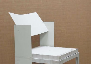
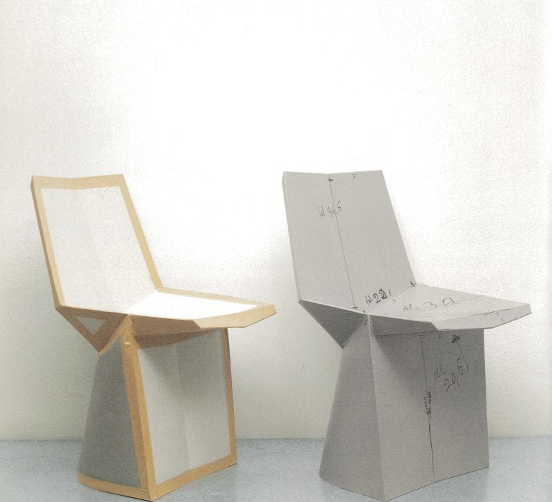
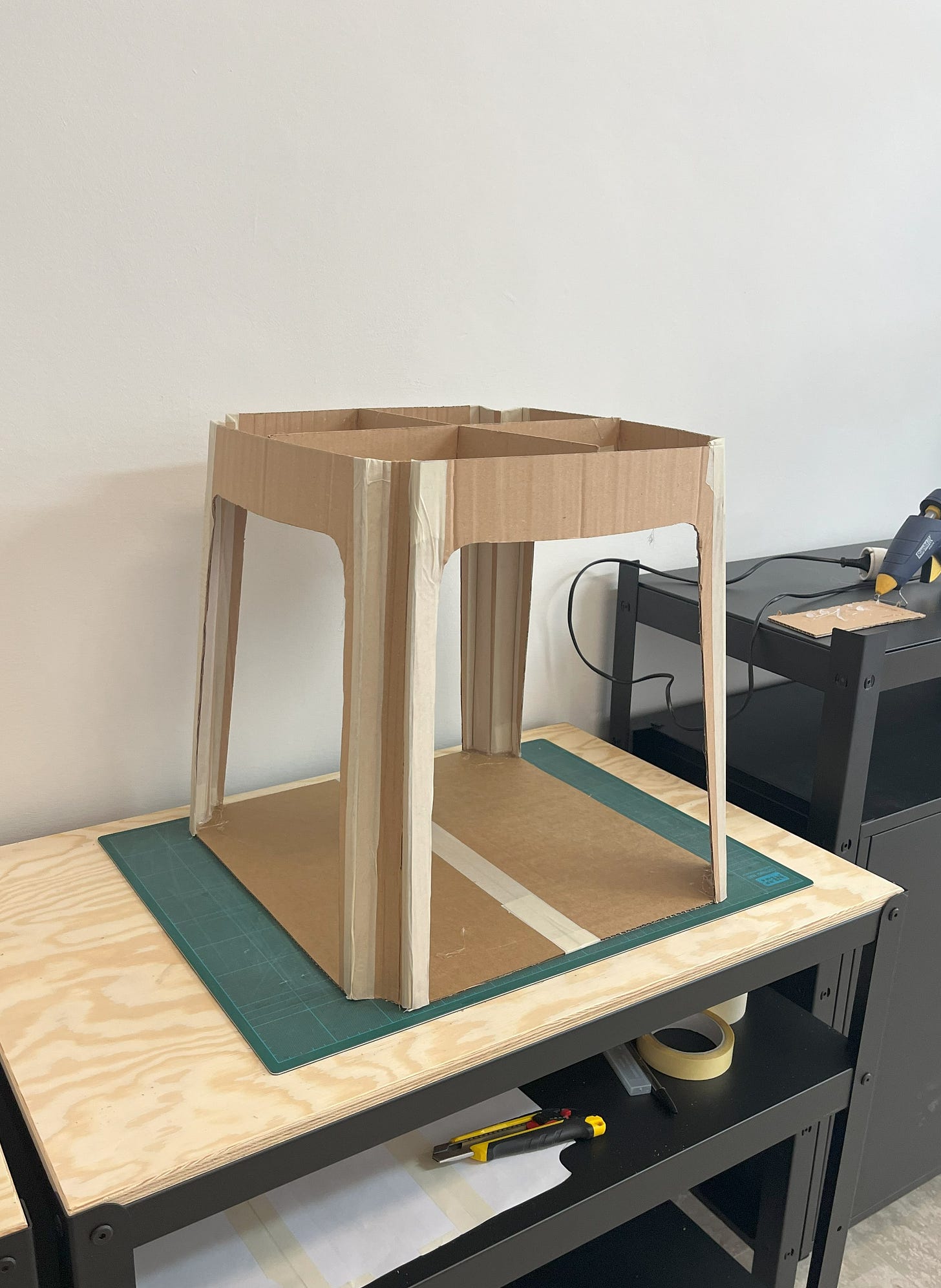
Unfortunately, my 3D printer is still broken, which has slowed the development of the chair project.
But I built a cardboard model to test dimensions. Here’s a quick picture.
It’s not precise, it’s just preparation for a full-scale 3D print.
I’ve never printed something this big in-house (usually I send it out), but this is an experiment in doing everything inside the studio.
Also: I’ve started a project with a DTC brand (Direct to Consumer).
It’s a completely different workflow. Many traditional companies still don’t get how much context affects value.
I’ve identified 3 principles for designing for DTC brands.
Would you like me to write about this in a future issue?
Let me know in the poll.
Things to see
A couple years ago, I discovered Matthew Encina’s YouTube channel while looking for designers who share their real process.
He’s not only a solid designer, he’s an incredible communicator.
He doesn’t post often (because real design takes time), but when he does, it’s full of insight.
Recently, he shared the full process behind building a brand.
It’s the perfect video for a lunch break to kickstart your afternoon.
Definitely worth checking out and dig around for his product design content too.
Design I like
Today’s spotlight: the Craftica stool by Formafantasma.
They don’t just create meaning in their work, they have one of the most delicate signatures I’ve seen.
Their pieces have the same elegance as iconic fashion pieces that never go out of style.
This stool is a perfect example: the way they use eclipses for both top and legs, the roundness of the forms, it’s soft, minimal, and completely timeless.
This newsletter isn't for me, it's for you. I believe that opening a window to the world is crucial for designers to help others understand how profound and complex this profession is.
📣 Please join me in spreading the word - not only to share these insights, but also to inspire others to do the same.
The more of us there are, the better it is!
Cheers!
Mario
In case someone has forwarded this email to you, subscribe and join the community of Designer From Nowhere.






Great update 👌 always nice to see the low fidelity prototypes, you can’t beat card to really get a sense for an idea, especially at 1:1 scale.