

Images can make (or break) your design
Good design is the foundation, but without great communication it remains an unfinished work.

While you’re focused on creating the best design possible, some mid-range idea out there s blowing up and becoming successful.
How is it possible that those average designs become bestsellers?”
This happens to designers selling ideas to companies – or to companies selling products to customers. It’s not about being lucky or showing off, it’s about giving 100% value to what you are doing. And willingly or unwillingly it’s the main factor of success.
This post of “Designer From Nowhere” is brought to you by:

The importance of a good image
I still have the vivid memory of my prototyping class teacher who tried to teach 20-year-old students how important pictures are.
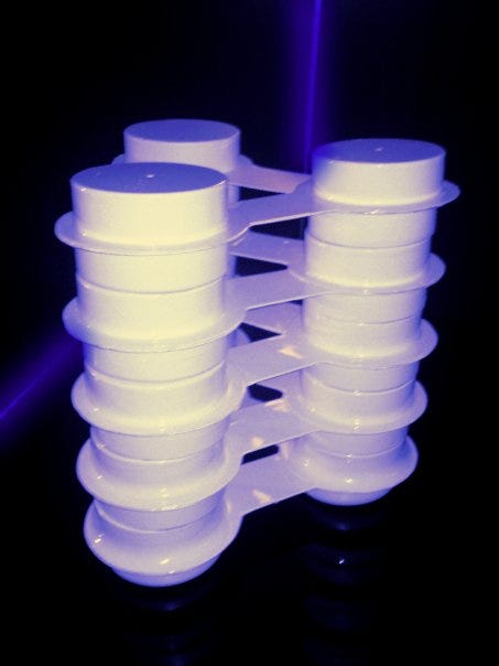
It was the time Eindhoven Design Academy was changing the design rules and the designer’s role in Europe, and he showed us the picture of a very simple candle made from some recycled wax. It was just a small cylinder, but the mood and the explanation expressed from a single picture burned something inside me. Why was that so great even if it was just a simple irregular cylinder?


The way that candle wax was communicated was simply perfect, with the right images. A thermoformed stool I was doing at the time, made in one month of work with a handmade wood mould, was not that effective. In person, it would have won. But in terms of communication, it lost from the start simply because it was not communicated well enough. I tried to make the perfect image, but I missed the right environment, the right lens, the right colors. I missed everything. So I did something elaborated/complex, but wrong.
The illusion of being an intellectual
There’s a huge mistake that people make when communicating, especially if they spend a lot of effort making something and put a lot of theory in what they do.
When we do something that we think is great, we think that it needs to be communicated in the best way possible: great image, great copy, great exhibition. Sometimes we confuse great with redundant.
Staging a new painted stool inside an 1800s French villa might look fancy, but without a clear goal it just burns money. Trusting your gut instead of strategy often ends in ineffective campaigns.
The fact that good examples in the past – great labels or skilled designers – had success staging their product in that kind of environment, doesn’t mean that’s the rule. Especially if you think that the rule is still valid after 20 or 30 years.
The number one rule is to focus on the scope: what are you trying to say, and what’s the clearest way to say it?
To see this in action, let’s compare two real-world examples.
Labels - case study


Here we have two images of DTC brands that sell online products for living.
On the left we have a standard bathroom. Calm atmosphere with the products highlighted by their color which, even if pastel, stands out well. On the right we have a minimal black and white wall with some bathroom products on it.
Who wins?
We have a winner on the left.
Even if your designer – probably a CGI designer – has done a good job, there are a few things that make the image on the left much more effective for conversion to sales.
On the right we have a situation that probably we will never see in a house, more in a showroom. If I target distributors, this may look like a stage suggestion for their showroom.
If you use this to sell products directly, it’s on the wrong path.
First it’s too homogeneous and I don’t even get what products are – is the tap included in the collection for example? It has the same color as the accessories. It’s evident that it’s CGI and it’s very cold, not very well done, no reality perceived. Then, who’s going to put a (beautiful btw) €660 lamp near a sink? This first happens doing things not with strategy but because “everyone does it that way,” then leaving critical decisions to the wrong hands.
The first picture could be done even more professionally – sure – but in this case it was enough for the scope.
Designers - case study
We must remember why we create images, like above.
It’s important to make nice images, but that’s not always the point. First focus on what you want to communicate, then do it as best as you can.
Most of our images are created to be shared with clients or for PR / social media purposes. And those images don’t have to be the same.
A company asked you a design for a specific reason: new shape, new function, innovation, whatever. And the image must be functional to express it.
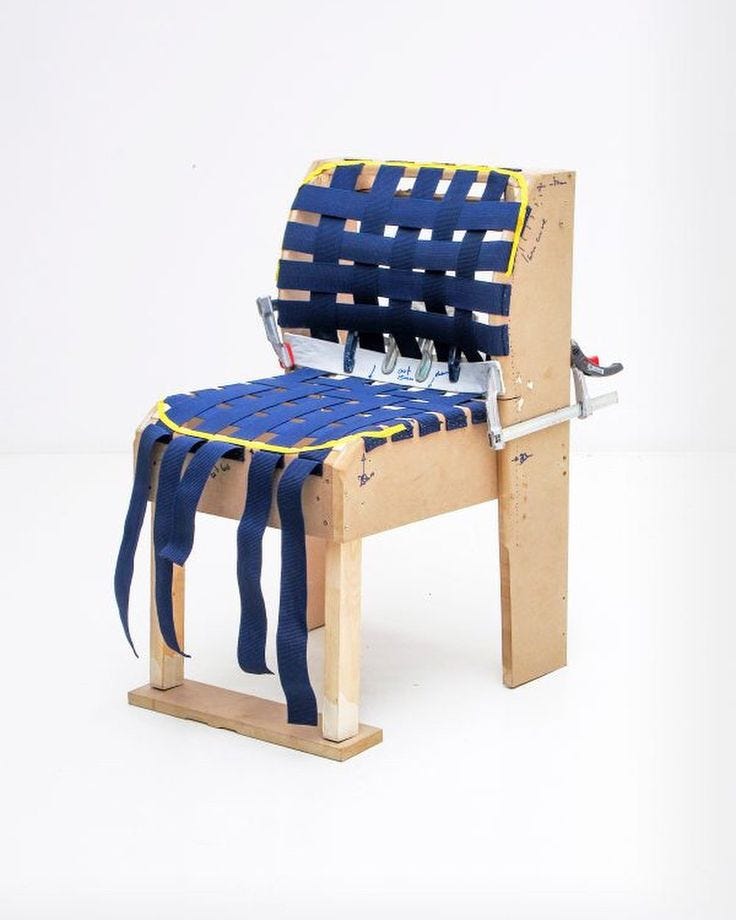
Take the image above. Do final customers care how Stefan Diez made a chair? No. Does the design world care? Absolutely.
What he’s saying in this image is:
I can make innovative construction;
I can make a proof of concept.
Basically the message is: I do research, I innovate, and I create something feasible.
Then the side effect is that these images are very engaging in terms of online stories, so magazines will share it to get more traffic. The result is that this message spreads through the design world and to potential clients that embrace the philosophy of the “well done, effective and innovative.” Not by chance, investing in communication has worked well for Diez who is now one of the world’s top players.

Is this relevant when you make a design proposal? Yes and no. If proof of concept is not needed, that’s not necessary, but sometimes it can be useful even if your client doesn’t need it.
If, for example, your concept may look “too simple,” but you see the potential, adding more materials to prove that it is good, even if redundant, can help to improve the authority of what you’re doing. That’s why making a prototype when pitching a design creates much more effectiveness in the proposal.
That’s the real lesson here: images don’t just “show” design, they position you in the market you want to play in. So ask yourself if your images made for designers or for the people you target to know about the product?
This argument is so huge that a masterclass would be needed, but I think this for now is enough to let you think more about it.
If this made you rethink your own product images, leave a ♡ and share it with someone who needs to hear it.
Studio life
Busy weeks trying to figure out how to manage finances for next year. I’m planning to create a short guide to manage my finances and bring some definitive order to it. Due to the success of “How I plan my finances for 2025,” I think I will try to create my first digital product, a template with a mini-guide to manage money well for designers and studios. Let me know in the poll, if it doesn’t resonate, I’ll keep it in my drawer.
While I’m trying to convince myself to update my website with the new Bridge collection for Iludi, I’ve found a new concept for a lamp and I’m working on some rapid prototyping for proof of concept.
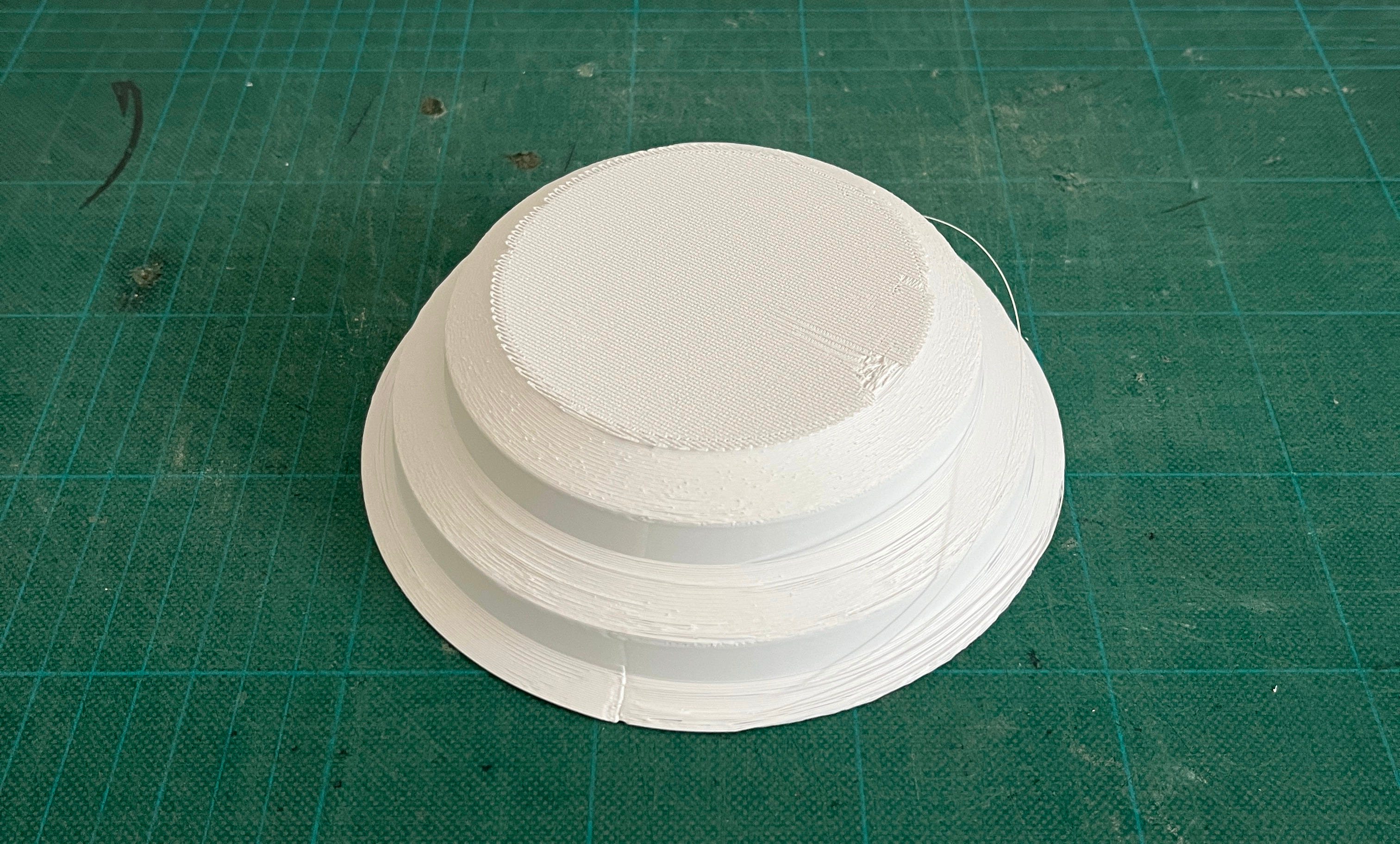
I won’t reveal the final design yet, but the problem I’m sure I will face is that my intention is to create something archetypal - like a dome.
When you propose an archetype, you really need something special to convince a label to put it into production. In this case I’m sure that being “less special” is a strategic advantage to create the right vibes for people who’ll buy the lamp. This is going to make it very difficult to propose - let’s see what happens.
Things to know
Design Models.
New editorial on DesignWanted on the way. It’s called Design Models and I will explore more in depth how successful people run their business in the design world: studios, companies, independent labels and so on. I love this stuff. For now, have a look at the introduction article; in the next weeks you will read more detailed stories. Click on the image to see the article.

Nice video by Oren John
Love this video about personal branding. I think designers and entrepreneurs will find it very inspiring.
A design I like
Let me introduce the Riscio table lamp by Joe Colombo, designed in 1968.

In 2025, if you ask a designer to make a table lamp, he will probably end up doing something like this (but if you dig deeper, you’ll see that this lamp is not exactly an archetype).
Now we should ask ourselves: if Joe Colombo did it 57 years ago and I’m still doing similar things, where is design really heading?
I don’t know the answer, mine is just a provocation. But if we still think that we can propose something similar, we should investigate if we are really making innovation or just following trends from our Pinterest board.
This newsletter is supported by:

Don’t forget to show support, like and share!
And in case someone forwarded this to you:
With love,
Mario
If you want more:
I feel like this topic isn't spoken about enough, if even at all. Food for thought, thanks Mario!
great one!